
The Affordable Home Finds That Make a Room Feel Instantly Elevated

Photo Credit:@shaneka_e_
I once spent an entire Saturday moving the same lamp around my apartment because the living room felt off. First it went beside the sofa. Then it went behind the chair. At one point, I stood in the doorway holding the lamp like I was on a home makeover show with absolutely no crew and no reveal budget.
The lamp was not the real problem. One tiny light was trying to carry the whole room, the curtains stopped awkwardly below the windowsill and every small decorative object I owned was competing for attention. I did not need a new sofa or a contractor. I needed better scale, calmer sightlines and lighting that made the room look as warm at night as it did in my head.
That is the secret behind most spaces that feel polished: the expensive look often comes from proportion and restraint, not an expensive receipt. A $30 curtain panel hung correctly can look more elevated than a costly one that is too short. A cleared countertop can do more for a kitchen than another decorative purchase. Even the nicest pieces lose their impact when everything is undersized, poorly lit or surrounded by visual noise.
If you have been wondering how to make your home look expensive without renovating, start with the ideas that solve something you notice every day. You do not need to complete all 27 this weekend. Pick one room, identify what feels unfinished and use this list as a menu—not another reason to shop for a whole new personality.
1. Hang your curtains close to the ceiling
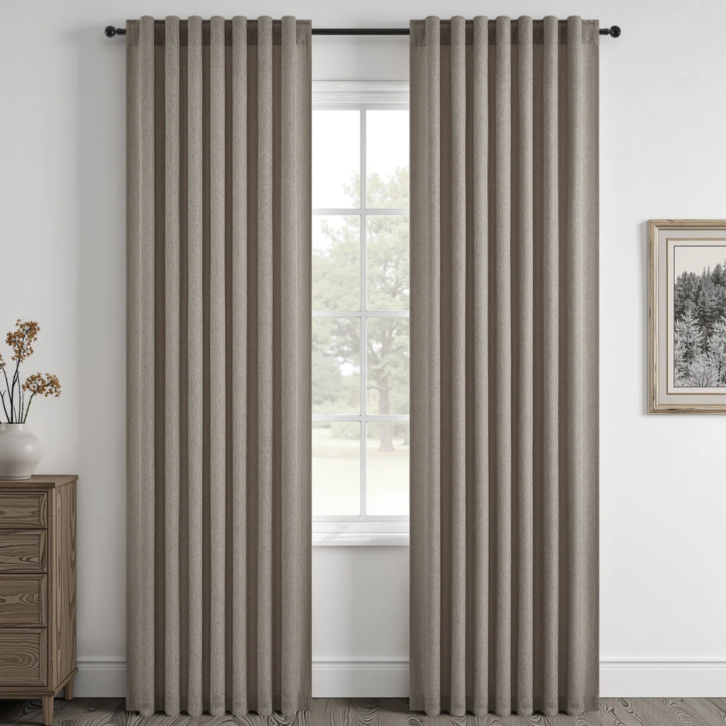
Curtains look most intentional when they relate to the height of the room rather than hugging the top of the window. Mount the rod several inches above the frame—or close to the ceiling when the proportions allow—and let the panels lightly skim the floor. That uninterrupted vertical line draws the eye upward and makes an ordinary window feel taller.
The detail that gives away the budget version is usually length. Panels that stop several inches above the floor can make the wall look chopped in half. If custom curtains are not realistic, buy the longer standard length and use iron-on hemming tape. Renters can try sturdy no-drill brackets, but always check their weight limit before hanging heavy fabric.
2. Extend the curtain rod beyond the window
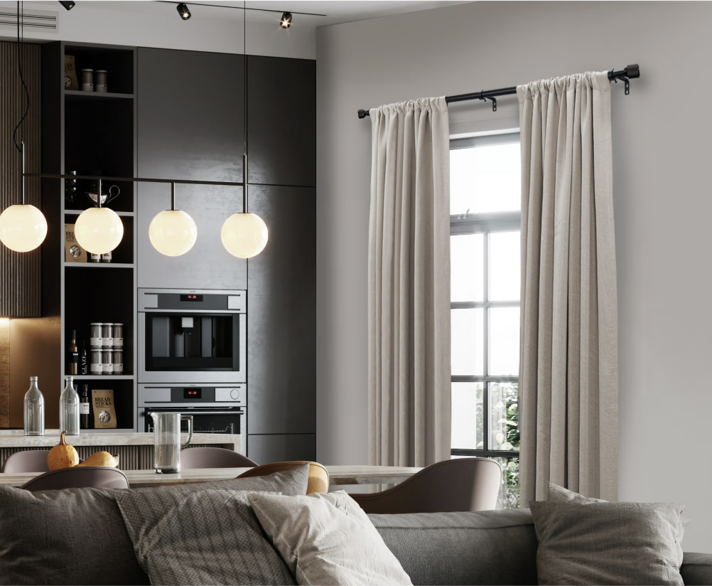
If the curtain panels cover half the glass when they are open, the window will look smaller and the room will lose natural light. Extend the rod approximately 6 to 12 inches beyond each side when wall space allows. This gives the fabric somewhere to rest beside the window instead of directly in front of it.
You do not need massive puddles of fabric to create fullness. Aim for a combined curtain width around one-and-a-half to two times the width of the window. The result should look generous when closed but not so bulky that it overwhelms the wall. Before ordering, measure the full planned rod width—not only the glass.
3. Choose a rug that actually reaches the furniture
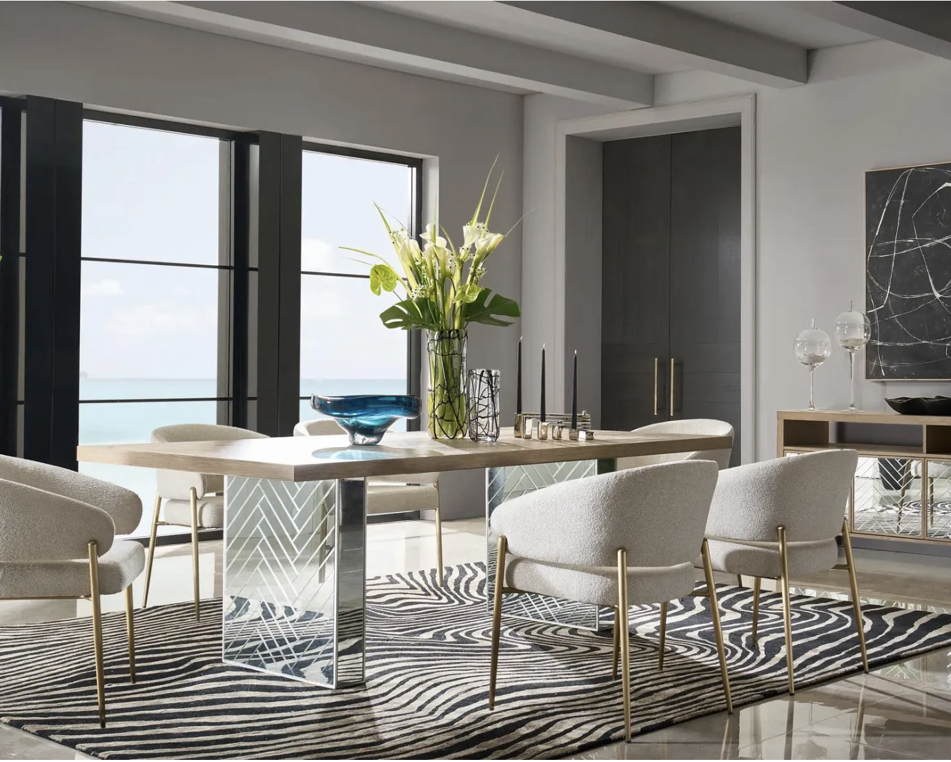
An undersized rug can make even beautiful furniture look like it is waiting in separate zip codes. In a living room, choose a rug large enough for at least the front legs of the sofa and chairs to rest on it. In a dining room, chairs should remain on the rug when pulled out so no one catches a leg on the edge.
Use painter’s tape to map the dimensions on the floor before buying. This is one of those purchases where the larger size may cost more, but it often eliminates the urge to keep adding smaller objects to make the room feel complete. If your current rug is too small, layering it over a larger natural-fiber rug can be a practical fix.
4. Replace several tiny accessories with one substantial piece
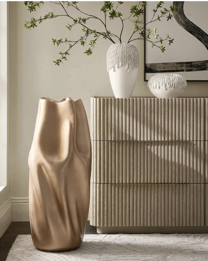
When a console is covered with six little frames, three candles and a bowl that does not hold anything, the eye does not know where to land. Try removing everything and returning only one larger lamp, one generous piece of art and a useful bowl or tray. Fewer pieces with stronger scale usually create more impact than a crowd of small decor.
This does not mean throwing away sentimental objects. Rotate them, group a few related pieces together or give them a dedicated shelf instead of spreading them across every surface. The goal is to make the room feel edited, not impersonal. A large vase, sculptural bowl or oversized framed print is an ideal shopping moment if the room genuinely lacks an anchor.
5. Use correctly scaled artwork
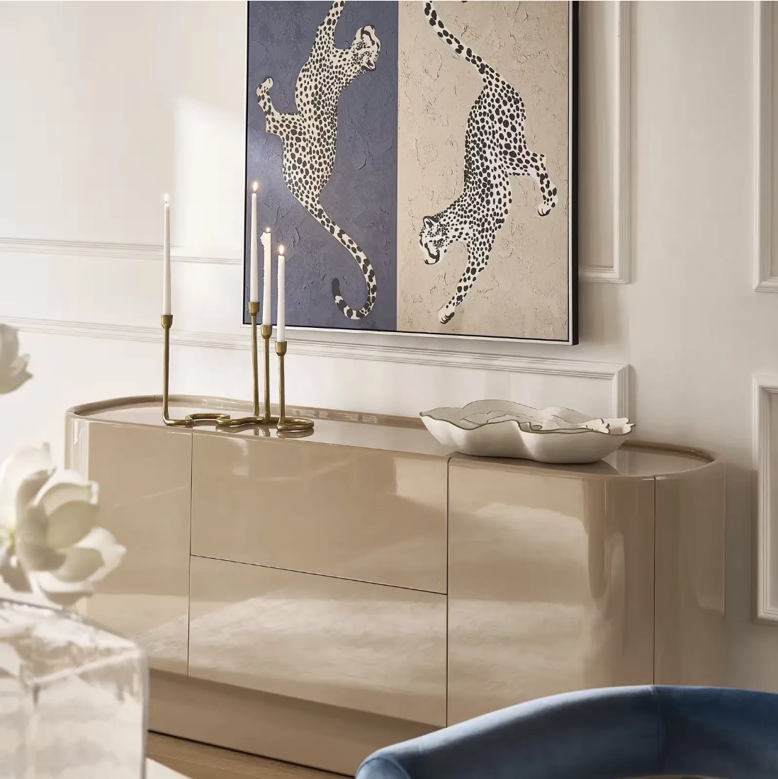
Art should feel connected to the furniture below it. Over a sofa, bed or console, aim for a piece—or a cohesive grouping—that fills roughly two-thirds of the furniture width. A tiny frame floating alone over a large sofa makes the whole wall feel unfinished, no matter how much the art cost.
Before committing, tape together paper in the size you are considering and leave it on the wall for a day. You will see immediately whether the room needs one large piece, a pair or a tighter gallery arrangement. Digital-download art in a large ready-made frame can create scale affordably; just budget for printing before assuming the download is the inexpensive part.
6. Lower artwork that is hovering too high
One of the fastest free upgrades is moving art down. As a starting point, place the center of a standalone piece around 57 to 60 inches from the floor, then adjust for the furniture and ceiling height. Above a sofa or console, the bottom of the frame often looks best approximately 6 to 10 inches above the furniture.
Those numbers are guides, not laws. The real test is whether the art belongs to the arrangement or appears to be escaping toward the ceiling. Ask someone to hold it while you step back, or trace the frame with painter’s tape. Filling old nail holes is still less expensive than living with a placement that bothers you every time you enter the room.
7. Layer ambient, task and accent lighting
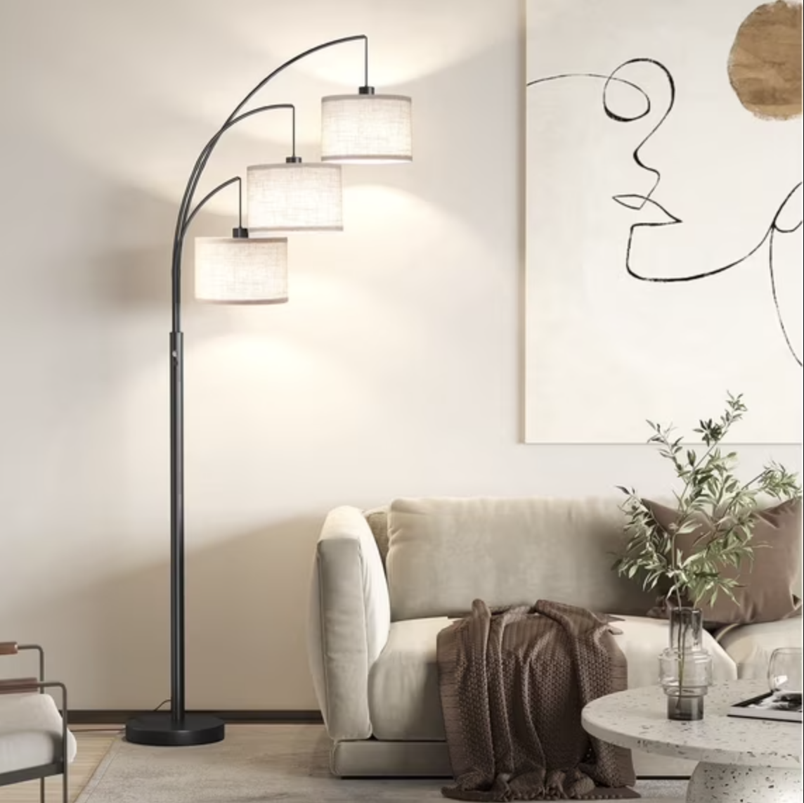
A room lit only by one overhead fixture tends to feel flat at best and vaguely interrogation-room at worst. Give the space three jobs: ambient light for general visibility, task light for reading or working and accent light to soften a corner or highlight art. That might mean a ceiling fixture, a floor lamp beside the sofa and a small lamp on the console.
You do not need to buy all three at once. Start where you spend evenings and add the light you keep wishing existed. Plug-in wall sconces are useful when table space is limited, and rechargeable lamps can brighten a shelf without requiring an outlet nearby. More fixtures are not automatically better; each one should serve a specific part of the room.
8. Use one warm bulb temperature throughout connected rooms
When one lamp glows warm yellow and the next throws blue-white light, the room feels pieced together. For living rooms and bedrooms, bulbs around 2700K usually create a warm, comfortable effect. Kitchens and work areas may need brighter task lighting, but connected fixtures should still look like they belong to the same home.
Check brightness as well as color temperature. A beautiful shade cannot rescue a bulb that is harsh enough to light a parking lot. If you rent or share a home, label working bulbs before storing them so you can reinstall them later. Smart bulbs are helpful only if you will actually use the settings; a consistent pack of regular bulbs can solve the same visual problem for less.
9. Put lamps at more than one height
Light looks richer when it comes from different levels. A floor lamp can lift a dark corner, a table lamp creates a comfortable pool of light near eye level and a small accent lamp gives a bookcase or kitchen counter a soft glow. Together, those layers create depth after sunset.
Look around the room at night with the overhead light turned off. The dark patch you notice first is where another light source may be useful. Avoid lining every lamp up at exactly the same height, and do not crowd narrow walkways with unstable floor lamps. In a small apartment, one swing-arm sconce or compact lamp can solve the problem without sacrificing valuable floor space.
10. Upgrade a basic lampshade before replacing the lamp
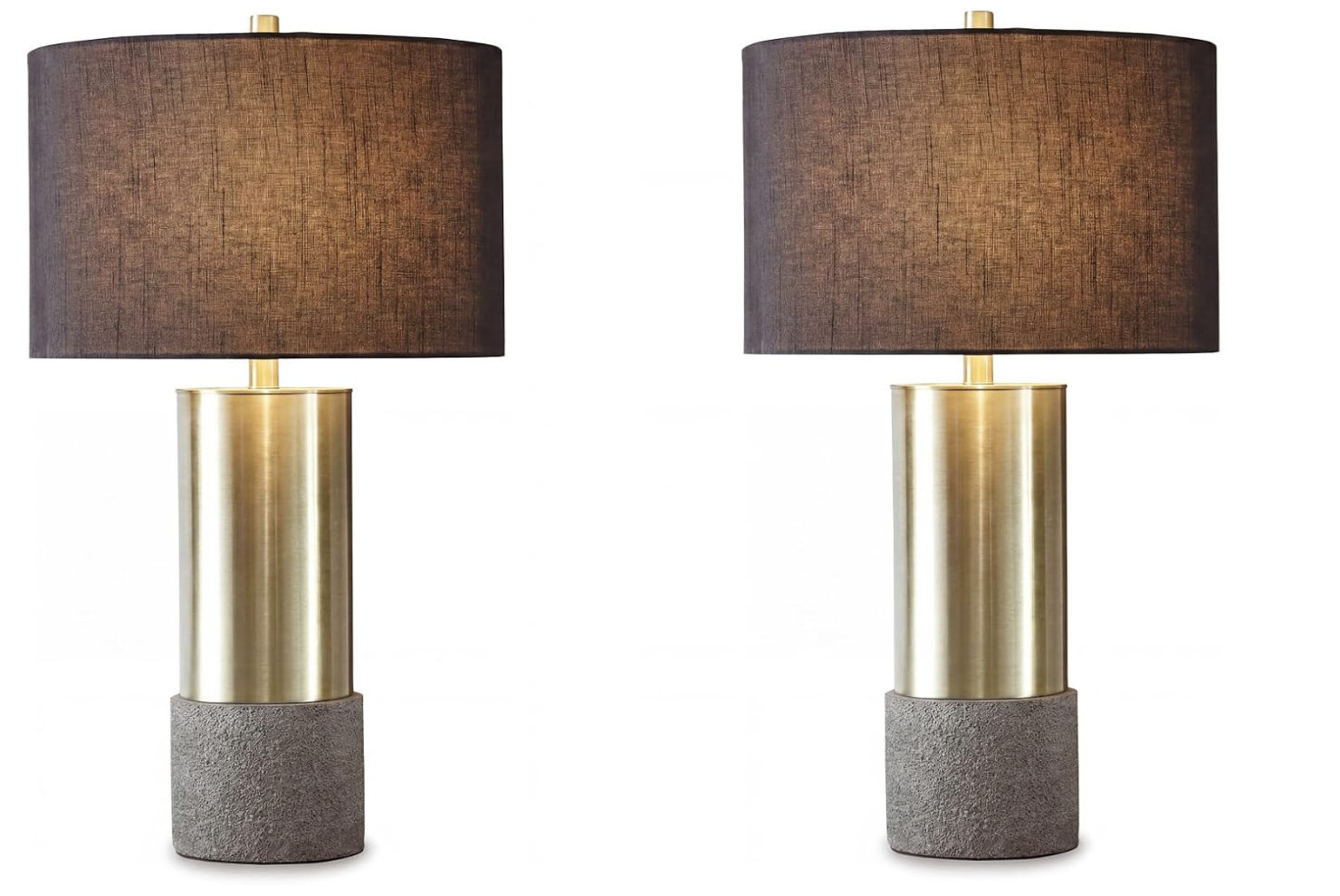
A lamp base can be perfectly fine while its shiny, undersized shade makes the whole thing look cheaper. Try a pleated, linen-look or gently tapered shade in a size that balances the base. As a loose guide, the shade should cover the socket hardware and feel substantial without extending so far that it becomes easy to bump.
Pay attention to the fitting before ordering; spider, uno and clip-on shades are not interchangeable. Also check the bulb clearance and wattage guidance. This small swap works especially well on thrifted lamps, but never use damaged wiring or an unstable base for the sake of a pretty silhouette. If the lamp flickers or the cord is frayed, repair or replace it safely.
11. Limit each room to a clear color palette
A room can contain color and still feel calm. Choose two or three dominant shades, then repeat them in smaller doses through pillows, art, books or ceramics. Repetition is what makes pieces purchased at different times feel connected. Without it, every new color reads like a separate decision.
Start with what is hardest to change: flooring, large furniture and wall color. Pull your palette from those fixed elements instead of forcing the room to follow a trend. You are not banned from bringing home a bright object you love; just give it a visual friend somewhere else. Taking a phone photo of the room often makes random color interruptions easier to spot than standing inside it.
12. Add one dark note to a pale room
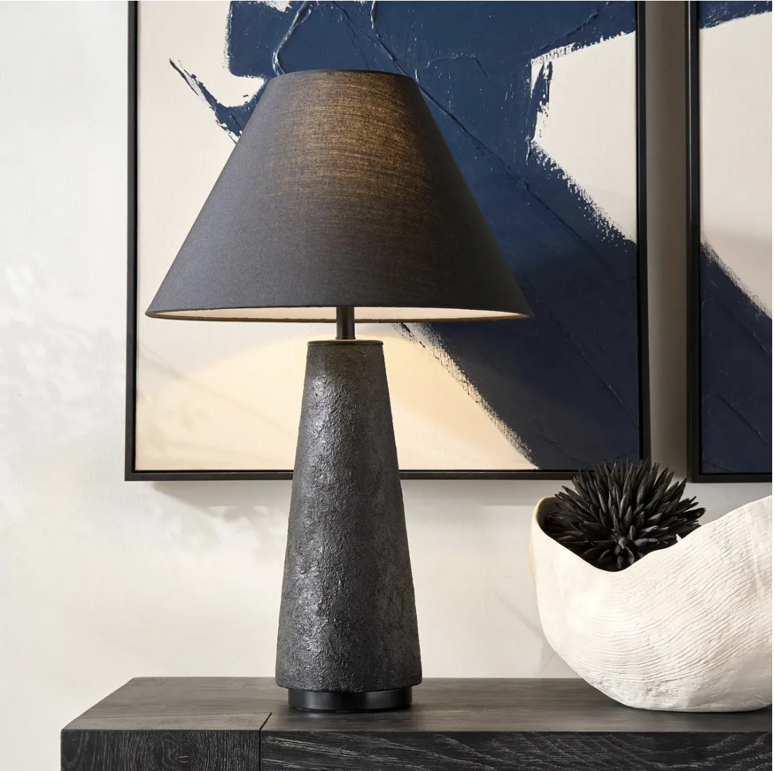
All-cream spaces can look beautiful in photos, but in real life they sometimes need contrast to feel grounded. A touch of chocolate brown, deep olive, navy, charcoal or oxblood gives the eye a resting place and makes lighter pieces look more deliberate. Try the color in a lamp base, frame, side table, pillow or small upholstered stool.
Keep this move controlled. One dark object in every corner can turn a light room into a spotted pattern. Begin with the area that already feels visually weak, then repeat the shade once or twice across the room. This is also an inexpensive way to make older dark furniture feel intentional instead of replacing it simply because pale wood is trending.
13. Repeat a wood tone instead of matching every piece
Rooms collected over time rarely contain one perfect furniture set—and that is usually a good thing. The polished look comes from repetition, not exact matching. If you have a walnut coffee table, echo that warmth in a frame, lamp base or wooden bowl. A lighter oak piece can still work when its undertone relates to something else nearby.
Pay attention to whether the woods lean warm, cool, red or gray. When two finishes clash, place a textile or painted piece between them rather than lining them up side by side. Do not refinish a family piece just to obey a design rule. A room with a few repeated tones feels layered; a room furnished from one matching set can feel more like a showroom.
14. Replace flimsy-looking plastic where it is always visible
Plastic is practical, but a collection of mismatched transparent bins and branded dispensers can make an open bathroom or kitchen feel busy. Replace only the visible pieces that affect the room every day: a cracked soap pump, an exposed wastebasket, a warped tray or an organizer that never stays upright. Ceramic, glass, metal, wood and woven textures add visual weight.
This is not a call to decant every product you own. Keep original labels when safety, expiration dates or instructions matter, and avoid glass where children can knock it down. The most sustainable upgrade is often using an existing bowl, jar or basket in a better location. Natural materials look elevated because they introduce texture—not because every container needs to match.
15. Steam the curtains, bedding and fabric shades
Nothing announces “just came out of a plastic package” like fold lines running across a curtain panel. Steam the visible wrinkles in curtains, duvet covers, pillow shams and fabric shades before deciding that the item itself looks cheap. This is a free finishing step with an outsized effect.
Follow the fabric-care label and test delicate material first. Keep a steamer away from outlets, finished wood and anything that can be damaged by moisture. If you do not own one, hanging washable curtains while they are slightly damp can soften wrinkles, but do not create indoor moisture problems. The point is not perfection; it is removing the creases that make the room look temporarily assembled.
16. Use fewer, fuller throw pillows
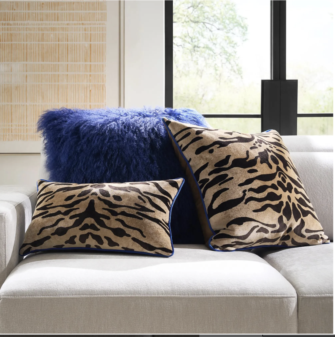
Five flat pillows do not automatically look more luxurious than two good ones. Choose fewer covers in a coordinated palette and use inserts that properly fill the corners. Many decorators size the insert slightly larger than the cover for a fuller shape, but check the cover construction so you do not strain the zipper.
Mix texture before adding another pattern: linen-look fabric, velvet, boucle or a subtle woven stripe can create depth within the same colors. Keep enough open seating for actual humans. If every evening begins with moving a mountain of pillows to the floor, the styling is working against the room. Store seasonal covers flat and reuse the inserts instead of buying complete new pillows each season.
17. Make the bed with two deliberate layers
An elevated bed does not require ten decorative pillows. Smooth the duvet, stack or stand the sleeping pillows neatly and add one intentional layer at the foot—a quilt, coverlet or folded blanket. That second layer creates contrast and makes basic bedding look considered.
Choose a blanket wide enough to relate to the mattress; a tiny throw placed diagonally can look like it landed there by accident. If you prefer a relaxed bed, embrace soft wrinkles consistently rather than mixing rumpled sheets with stiff decorative shams. Washable materials matter more than a styled photograph. The bed should take two minutes to reset, not require a morning production team.
18. Let the shower curtain reach the floor
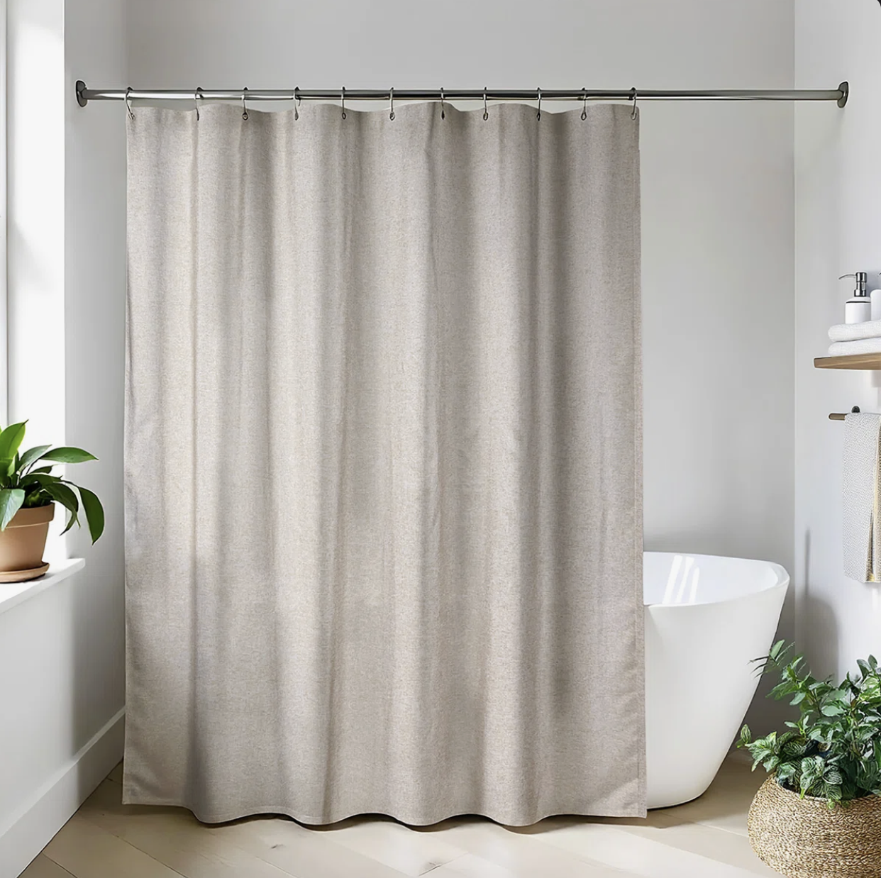
Bathroom curtains deserve the same proportion rules as living-room curtains. A shower curtain hung higher can draw the eye upward and soften a builder-basic tub, but the waterproof liner still needs to stay safely inside the tub. Measure before buying an extra-long curtain and confirm your rod can be installed securely.
Choose a fabric outer curtain in a solid color, quiet stripe or small-scale texture, then keep the liner separate so it can be cleaned or replaced. Do not let either layer pool on the bathroom floor, where it can hold moisture. A washable curtain, fresh liner and properly placed rod often create a bigger improvement than a counter full of decorative bathroom accessories.
19. Corral necessary objects on trays
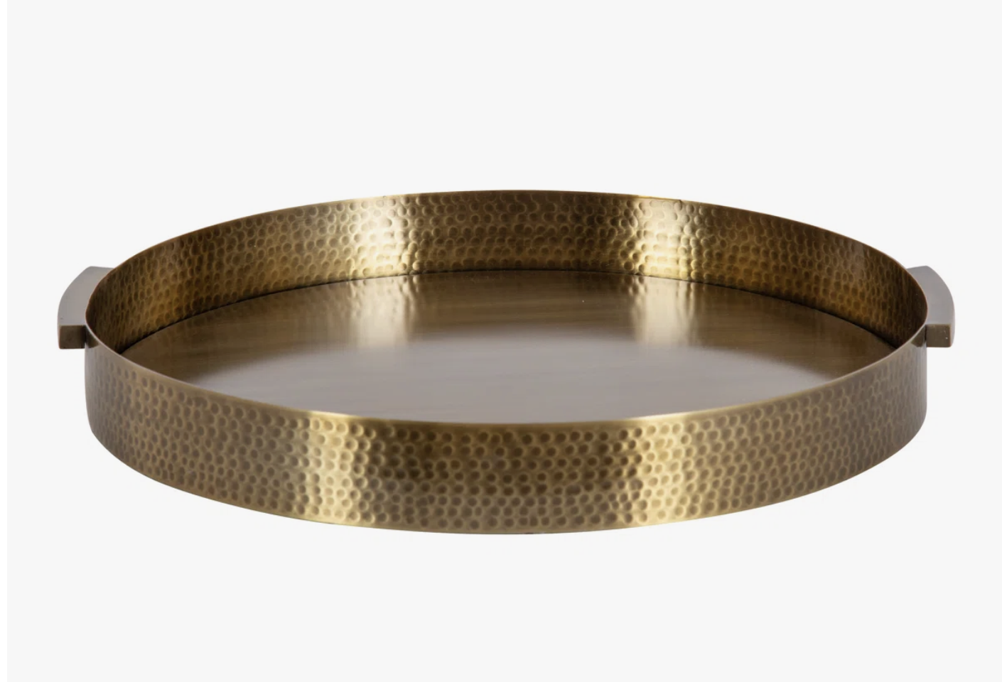
A tray tells the eye that several small items belong together. Use one for perfume on a dresser, oils beside the stove, coffee supplies or the remotes that otherwise migrate across the living room. The objects do not disappear, but they read as one organized unit instead of scattered clutter.
Choose a tray that leaves some visible border around the items; if every inch is packed, it becomes another crowded surface. Water-resistant material is best near a sink, while wood or woven trays suit dry areas. Shop your kitchen first—a shallow serving dish or small cutting board may already do the job. The tray should make resetting easier, not create a display you are afraid to touch.
20. Give everyday clutter a closed home near where it appears
Mail does not pile up because you lack discipline; it piles up because it does not have a convenient next destination. Place a lidded box, drawer or divided basket where the clutter naturally lands. Chargers belong near the outlet where they are used. Pet supplies belong near the door or feeding station. Hair tools need a heat-safe home near the mirror.
This is the unglamorous side of making a home look polished. The best storage system reduces steps, because a beautiful box across the room will not fix a habit that happens by the door. Avoid buying organizers until you measure the objects and the available space. A closed container is helpful only when you can still find what is inside.
21. Edit open shelves instead of filling every inch
Open shelving needs negative space to keep it from feeling like exposed storage. Remove everything, clean the shelf and rebuild with a mix of useful objects, books and a few larger decorative pieces. Vary the height, let some items overlap visually and leave enough empty space for each grouping to register.
Begin with the shelves closest to eye level because those create the strongest first impression. Put less attractive necessities in baskets or closed cabinets, but do not buy twelve matching bins unless you truly need twelve categories. A shelf should tell a small story about the people who live there—not display every object that failed to find a drawer.
22. Use books as risers, not random filler
A short stack of books can lift a lamp, bowl or framed photo and create the height variation that makes styling feel layered. Choose books you own, enjoy and are comfortable displaying. Turn the spines inward only if you genuinely prefer the quieter look; otherwise it can feel like hiding the most interesting part.
Keep stacks stable and away from candles, sinks and greasy cooking areas. Two or three books are usually enough. If you are buying books solely by color, stop and ask whether another object you already own could solve the same height problem. The luxurious feeling comes from thoughtful composition, not a shelf full of props you resent dusting.
23. Leave one surface intentionally empty
Every room needs somewhere the eye—and your grocery bags—can land. Clear the top of one nightstand, one end of the dining table or a portion of the kitchen counter. That negative space makes the objects you keep feel more important and gives daily life room to happen.
An empty surface is not unfinished. It is evidence that the room is not being used as permanent storage. If clearing it feels impossible, remove one category at a time and assign it a home. Do not “finish” the newly open area by buying another vase. Live with the blank space for a week and notice whether the entire room feels calmer.
24. Replace tired hardware selectively
Matching knobs or pulls can make a vanity, dresser or freestanding cabinet feel more cohesive, especially when the current hardware is scratched, loose or visibly different. Measure the center-to-center distance between existing screw holes before ordering. Reusing the same holes keeps the project simple and avoids permanent changes.
Renters should label and store every original piece for move-out. Start with one small furniture item before committing to an entire kitchen; finishes that look beautiful online may feel too shiny or too dark in your light. Tightening loose screws and cleaning existing hardware may be all the room needs. When drilling or electrical work is involved, use the right tools or hire qualified help.
25. Replace cracked or yellowed switch plates
Switch plates are easy to overlook precisely because we touch them every day. Clean, intact plates disappear into the wall; cracked, paint-covered or yellowed ones quietly make a room feel neglected. Replacing the cover—not the electrical device—can be an inexpensive finishing detail.
Turn off power at the breaker and confirm the area is safe before removing a plate. If you see damaged wiring, loose outlets, heat marks or anything beyond a straightforward cover swap, stop and call a qualified electrician. Renters should check their lease and keep the originals. You do not need decorative metal plates everywhere; simple, consistent covers often look the most polished.
26. Frame or visually soften a builder-grade mirror
A large frameless bathroom mirror can feel unfinished because it has no visual edge. A removable frame kit, carefully installed trim or slim adhesive border can give it more architectural presence without replacing the glass. The best finish usually relates to something already in the room, such as the vanity, hardware or light fixture.
Measure around clips, outlets and nearby faucets before ordering anything. Use products designed for humid spaces, and never attach heavy material with an adhesive that is not rated for the surface. Sometimes the better solution is simply adding balanced sconces, a small shelf or art beside the mirror. The goal is to integrate it—not create a bulky frame that crowds the sink.
27. Finish the room with a clean, subtle scent

Scent shapes the experience of a room before anyone notices the curtain height. Start with the unglamorous basics: empty trash, wash textiles, ventilate cooking odors and address moisture at the source. Fragrance should add atmosphere, never cover smoke, mold, pet accidents or sanitation problems.
Choose one scent direction for connected rooms rather than layering five competing products. A candle, diffuser or stovetop simmer pot can be enough. Keep flames, hot wax and essential oils away from children and pets; some oils and plants are unsafe for animals. The expensive feeling is not a powerful fragrance cloud. It is walking into a clean room that smells quietly cared for.
You May Also Like:
100 Amazon Finds Under $50 That Look Shockingly Expensive
How to Build an Expensive Looking Wardrobe From Amazon (Yes,Really)


✦ Creator images used for editorial purposes only. All rights belong to their respective creators. We always link and give credit.
✦ Check Out Our Men's Site
Trending on MensOutfitsDaily