
Here's Why Your Colorful Outfits Don't Always Work (And How to Fix It)
Color is the most personal thing in a wardrobe and somehow also the most avoided. Women who could pull off any shade spend years defaulting to black, cream, and the occasional stripe, not because they don't love color but because no one ever taught them how to actually use it.
This is that guide.
Ahead, every major color what it does, how to wear it, and what to pair it with. Consider this the reference you come back to every time you're standing in front of your closet wondering whether the red blazer is too much.
It's never too much. You just need to know what to do with it.
Why Most People Are Afraid of Color
It usually starts in adulthood. Somewhere between learning to dress professionally and absorbing the idea that simplicity reads as sophistication, color gets edited out. Black feels safe. Neutrals feel polished. Color feels like effort or worse, like a mistake waiting to happen.
The truth is that color feels hard not because it is, but because most people were never given a framework for it. When you don't know what pairs with what and why, wearing color is a gamble. That's not a personal failing it's a gap in fashion education.
How To Wear Red
Photo Credit:@thisistobiloba_
Red is the most psychologically loaded color in a wardrobe. It signals confidence before you say a word, which is exactly why so many women avoid it. The logic is backwards, red isn't hard to wear because it's too powerful— it's hard to wear because most people aren't used to being looked at.
The easiest entry point is an all-red outfit. When red is the whole look rather than one piece against a neutral base, it stops reading as accidental and starts reading as intentional. Red blazer and wide-leg trousers. A clean red midi dress. Red from shoulder to ankle any of these carries the same message: authority, not aggression.
Photo Credit:@milicaa_22_
Red's strongest neutral partners are white and camel. White gives you maximum contrast — the brightness of the red pops and the white reads as clean rather than cold. Camel warms the red down, pulling it away from the primary color wheel and toward something rich and European. Both work. Black with red is classic but the least interesting option if you have a red piece and want to grow your confidence with it, pair it with camel or white instead of defaulting to black.
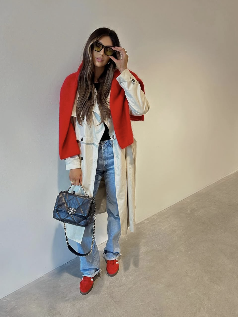
Photo Credit:@olivialaura_
Styling Note: If head-to-toe red feels like too big a leap, start with red as the single accent against a black or white base. A red shoulder bag with a black trouser and white button-down will teach your eye to trust the color before you commit to wearing it head to toe. Most people who 'can't wear red' are actually just wearing it in the wrong context as one piece in an undecided outfit instead of as the deliberate star.
This article breaks down the exact method to wearing bold colors.
How To Style Burgundy
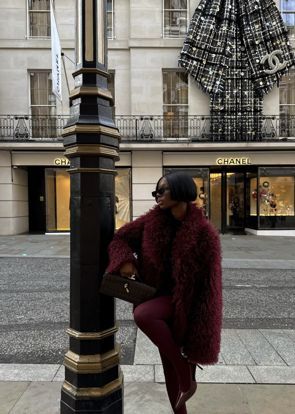
Photo Credit:@sialuxe_
Burgundy is what red looks like when it has somewhere important to be. The addition of blue undertones cools the intensity just enough to make it feel sophisticated rather than electric which makes it one of the most versatile non-neutral colors that exists. It works as a base, as an accent, and as a full-look color. It works in summer with linen and in winter with wool. It belongs on everyone.
The reason burgundy pairs so naturally with camel and cream is tonal logic, warm red-based hues sit in the same part of the spectrum as warm earth tones, and the eye reads them as belonging together. Navy and burgundy is a different kind of harmony both colors are deep, muted, and cool-adjacent, so together they feel rich rather than busy. That combination, done as a suit or a top-and-trouser pairing, is one of the strongest in this guide.
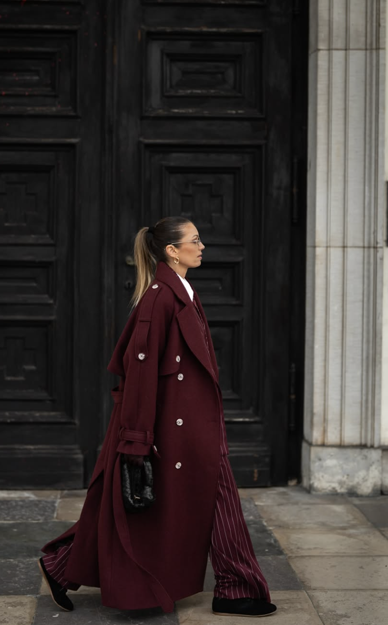
Photo Credit:@mrs.edithh
Where burgundy gets underestimated: as a neutral. A burgundy coat over cream knitwear and camel trousers functions as a neutral palette with depth. You're not doing color in the loud sense you're doing color the way the French do it, which is quietly and with intention.
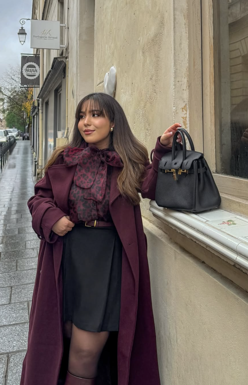
Photo Credit:@igbysalma
Styling Note: A burgundy midi skirt paired with a camel oversized blazer is one of the strongest no-fail color combinations in fashion. The warmth of the camel and the depth of the burgundy balance each other perfectly add white or cream underneath and you have a three-color outfit that looks expensive and curated without trying.
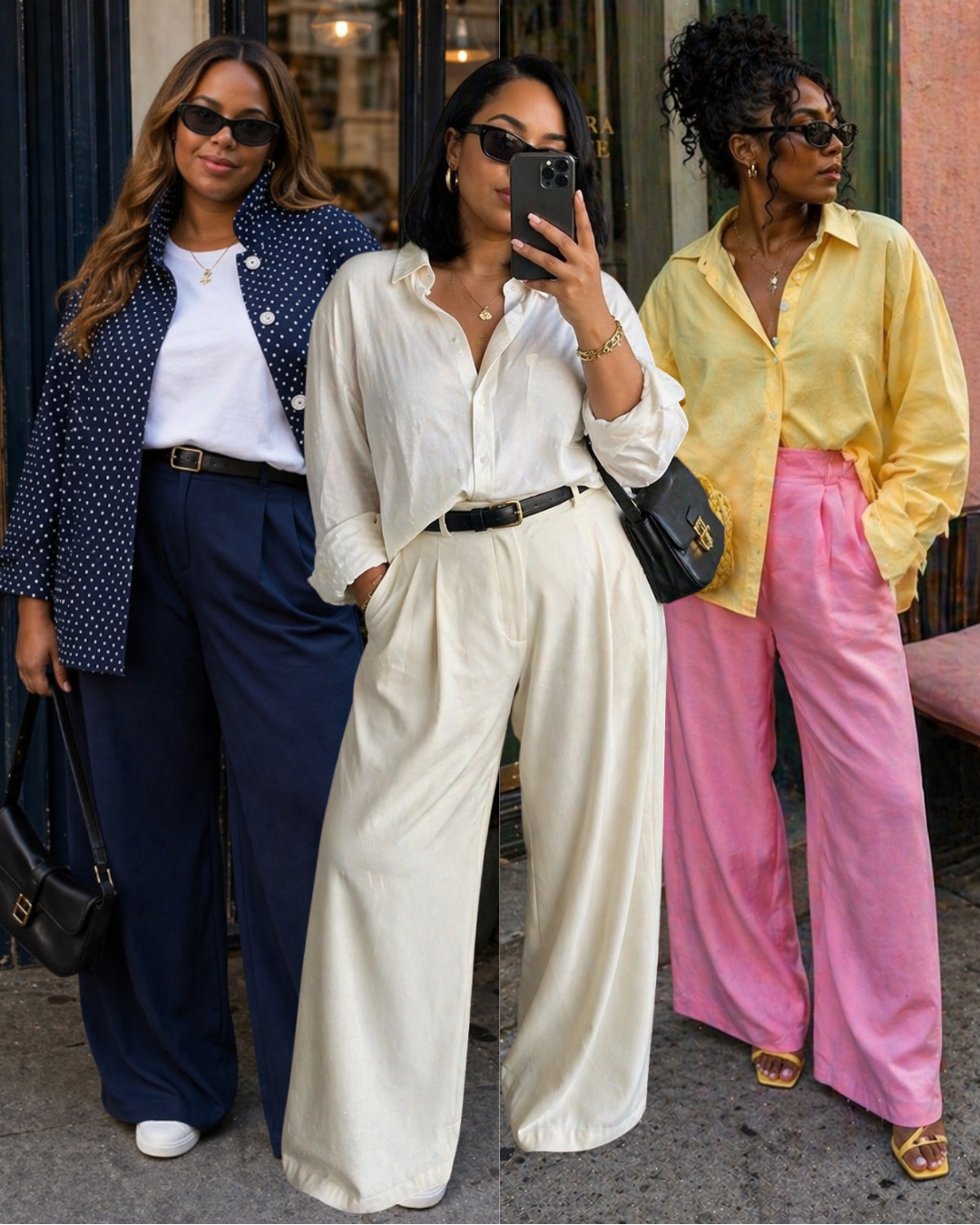
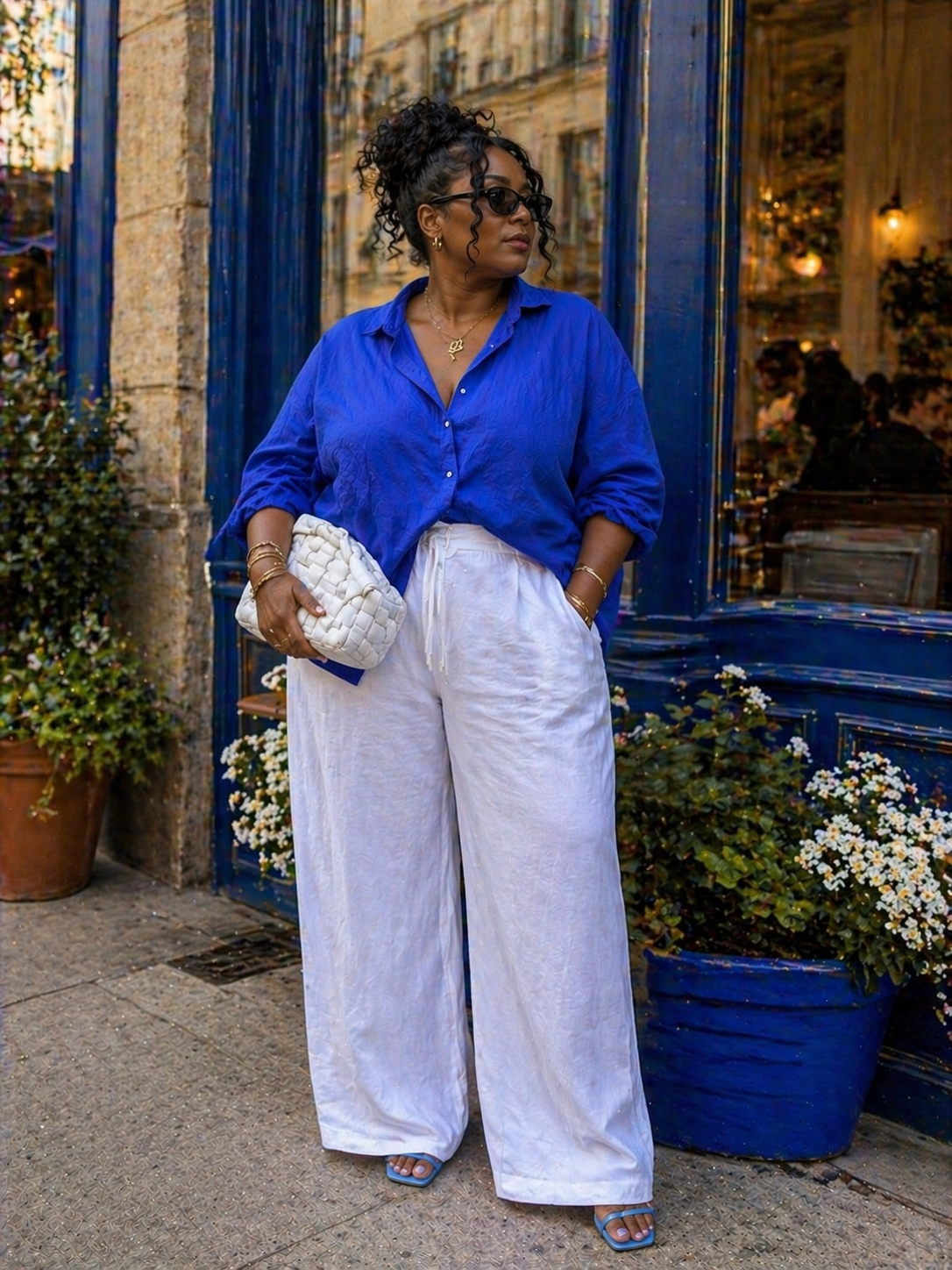
How To Wear Navy Blue
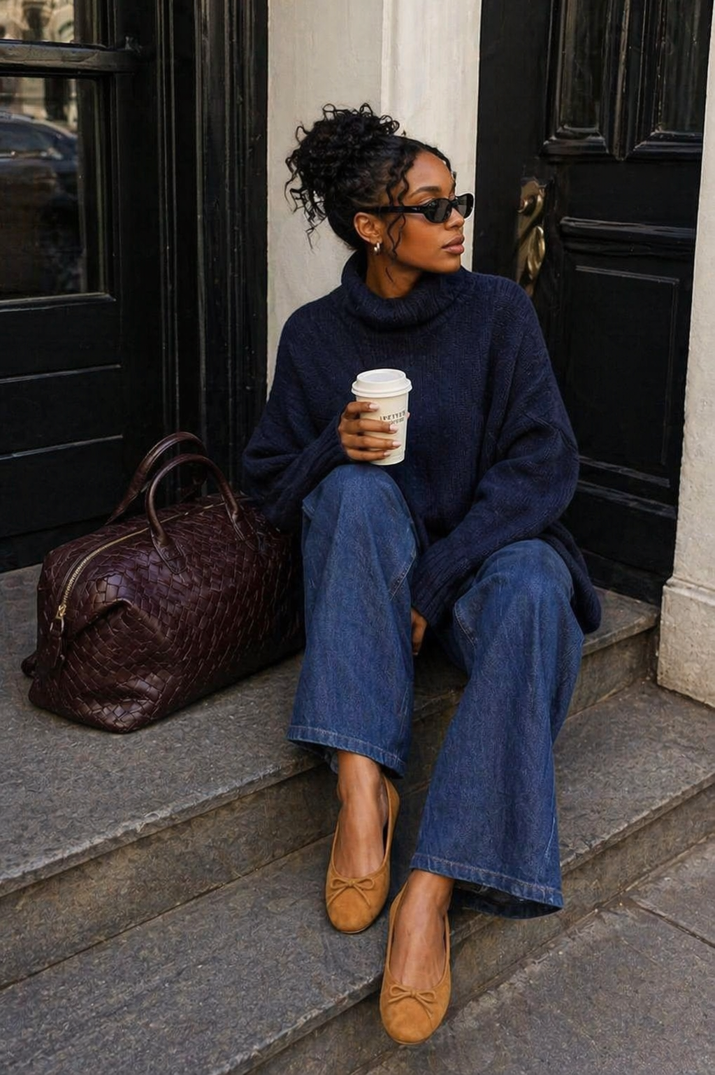
Navy is the color most people are already wearing without realizing they've entered color territory. It functions like a neutral — pairs with everything, reads in every season, never looks try-hard — but it has a depth and richness that black and grey can't replicate. That depth is exactly what makes it the best starting point for anyone who wants to build a bolder wardrobe without feeling like they're making a dramatic change.
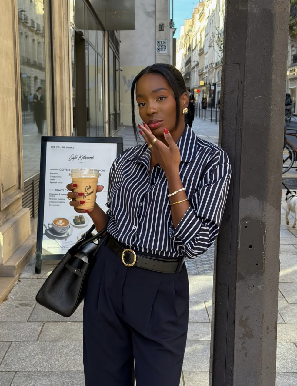
Photo Credit:@armellebrown
The strongest navy combinations use contrast. Navy and white is the cleanest version the contrast is high but the palette stays calm. Navy and camel brings warmth that navy lacks on its own this is the combination that looks effortlessly expensive because the two colors are pulling in opposite tonal directions while staying in harmony. Navy and burgundy, as noted above, is the combination that says 'I understand color' without announcing it.
The thing that makes navy feel modern rather than corporate is proportion. Wide-leg navy trousers with a relaxed white tee is current. Slim navy trousers with a fitted blazer is dated. The silhouette matters as much as the color navy in a stiff corporate shape will always read as a uniform, no matter how good the quality.
Styling Note: Navy is one of the best test colors for someone figuring out their wardrobe palette. Because it behaves like a neutral, you can add it to almost any existing outfit as an accent and see how it reads a navy bag, navy shoes, navy outerwear. Pay attention to whether navy makes your complexion look alive or muted if it does the former, it belongs in your wardrobe. If it does the latter, cobalt or teal might suit you better.
How To Wear Cobalt Blue
Photo Credit:@madisoneley
Cobalt is the version of blue that has no interest in being subtle. It is saturated, high-energy, and optically loud which means it works best when the rest of the outfit gets quiet. White is cobalt's strongest partner because the contrast is at its maximum and neither color competes with the other for attention. Black works too, but the result is heavier. Cream or ivory softens cobalt without dulling it — that combination has a warmth that white and cobalt doesn't.
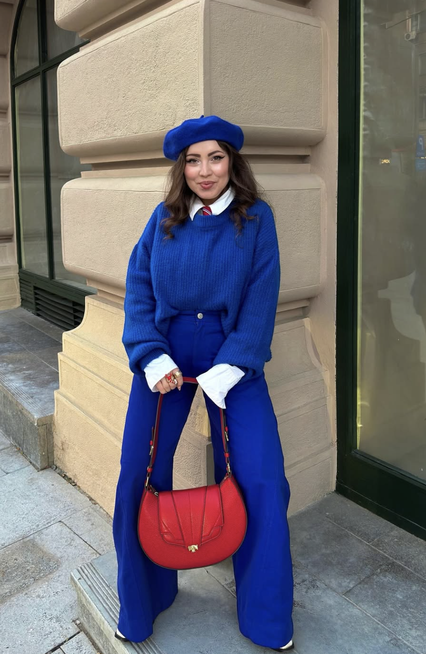
Photo Credit:@andrea.colorfulstyle
Where cobalt gets interesting is in its unexpected pairings. Cobalt and camel is warmer and more grounded than cobalt and white the electric blue gets an anchor, the camel gets a jolt of energy, and the result is a combination that looks fashion-forward without being difficult. Cobalt and yellow is technically a color-wheel pairing that should read as chaotic, but in practice lands as joyful and intentional when the proportions are right cobalt dominant, yellow as an accent.
Styling Note: Cobalt is one of the few colors that looks expensive in fast fashion and elevated in basics. A cobalt blue tee with well-fitted wide-leg jeans reads more pulled-together than a complicated outfit in a less confident color. The rule with cobalt: clean lines and minimal accessories. The color is doing the work let it
How To Wear Bright Green
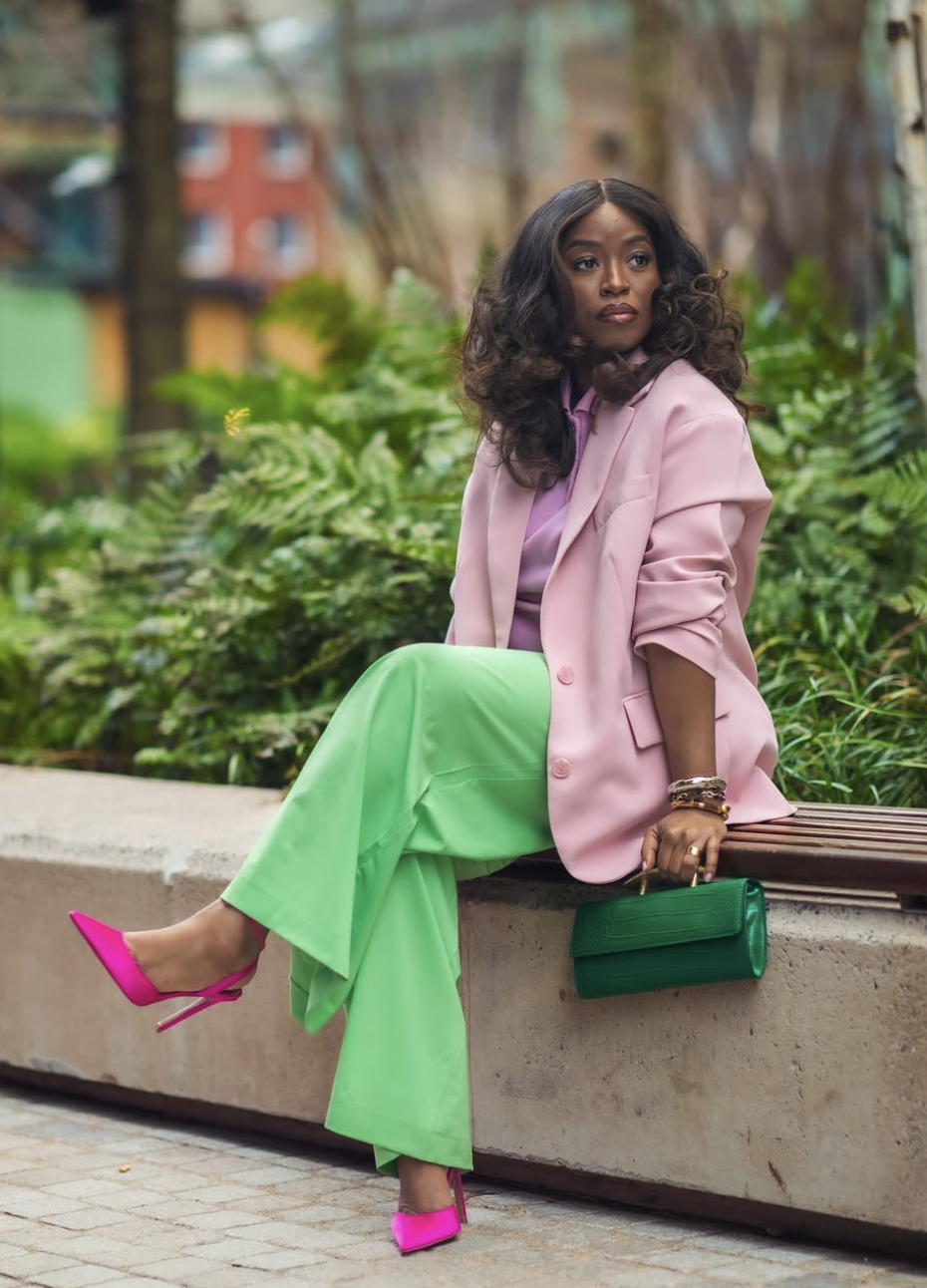
Photo Credit:@jariatudanita
Green has had the most dramatic rehabilitation of any color in the last decade. Once regarded as difficult —too tricky to find the right shade, too risky to pair green is now understood to exist on a spectrum broad enough that there is a green for every skin tone. Emerald specifically is the version that flatters the widest range, because the richness of the jewel tone plays off complexion depth rather than fighting it.
Emerald works with black (classic and dramatic), with cream (soft and unexpected), with camel (earthy and grounded), and with navy (a jewel-tone combination that looks deliberately rich). The pairing that feels most current: emerald with warm ivory or off-white. Not a bright stark white but a warm white that picks up the yellow undertone in the green and reads as cohesive rather than contrasting.
Photo Credit:@sarahtey_
Sage, olive, and forest green all follow similar logic but with different energy. Sage is the quieter, more neutral-adjacent version — it pairs almost like a neutral while still reading as a color choice. Forest green is the more saturated, autumn-winter version of emerald. All of them share the same basic pairing logic: warm neutrals (camel, cream, tan) ground them; cool neutrals (white, grey, black) sharpen them.
Photo Credit:@aimazin
Styling Note: The tone of your green matters more than the shade. Cool-toned greens (blue undertones, like teal and hunter green) look best against cooler complexions. Warm-toned greens (yellow undertones, like olive and emerald) flatter a wider range. When you're not sure: hold the garment near your face in natural light. Your complexion will tell you — it will either look bright and alive or slightly off. Trust the test, not the name on the tag.
How To Wear Purple
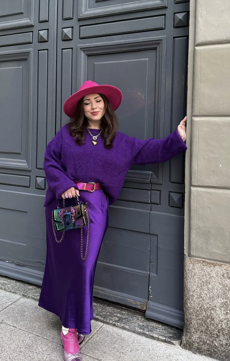
Photo Credit:@andrea.colorfulstyle
Purple has a reputation problem it doesn't deserve. Because it sits between warm and cool on the color wheel, it's harder to pair intuitively than red or blue — but that same in-between quality is what makes it so interesting to work with. Purple doesn't read as aggressive or cold; it reads as considered. And considered is exactly the impression a well-built wardrobe should give.
Deep purple and violet work best when given neutrals that don't fight them. Grey is purple's most natural partner — both colors occupy a similar atmospheric, slightly muted quality, and together they create a palette that feels refined without being severe. Camel with purple is more unexpected but equally strong: the earthiness of camel grounds what could otherwise be an overwhelming color and keeps the look from feeling precious.
Lavender and lilac are the softer, more accessible end of purple's range. They function almost as neutrals in summer — lavender with white reads as fresh and clean, lavender with cream reads as romantic without being overdressed. Lavender is also one of the best entry points into color for anyone who finds the brighter end of the spectrum intimidating.
Styling Note: The shade of purple matters for pairing: red-violet (warm) pairs best with camel, rust, and cream. Blue-violet (cool) pairs best with grey, navy, and white. Getting this distinction right is the difference between a purple outfit that looks intentional and one that feels slightly off without anyone being able to identify why.
How To Wear Orange
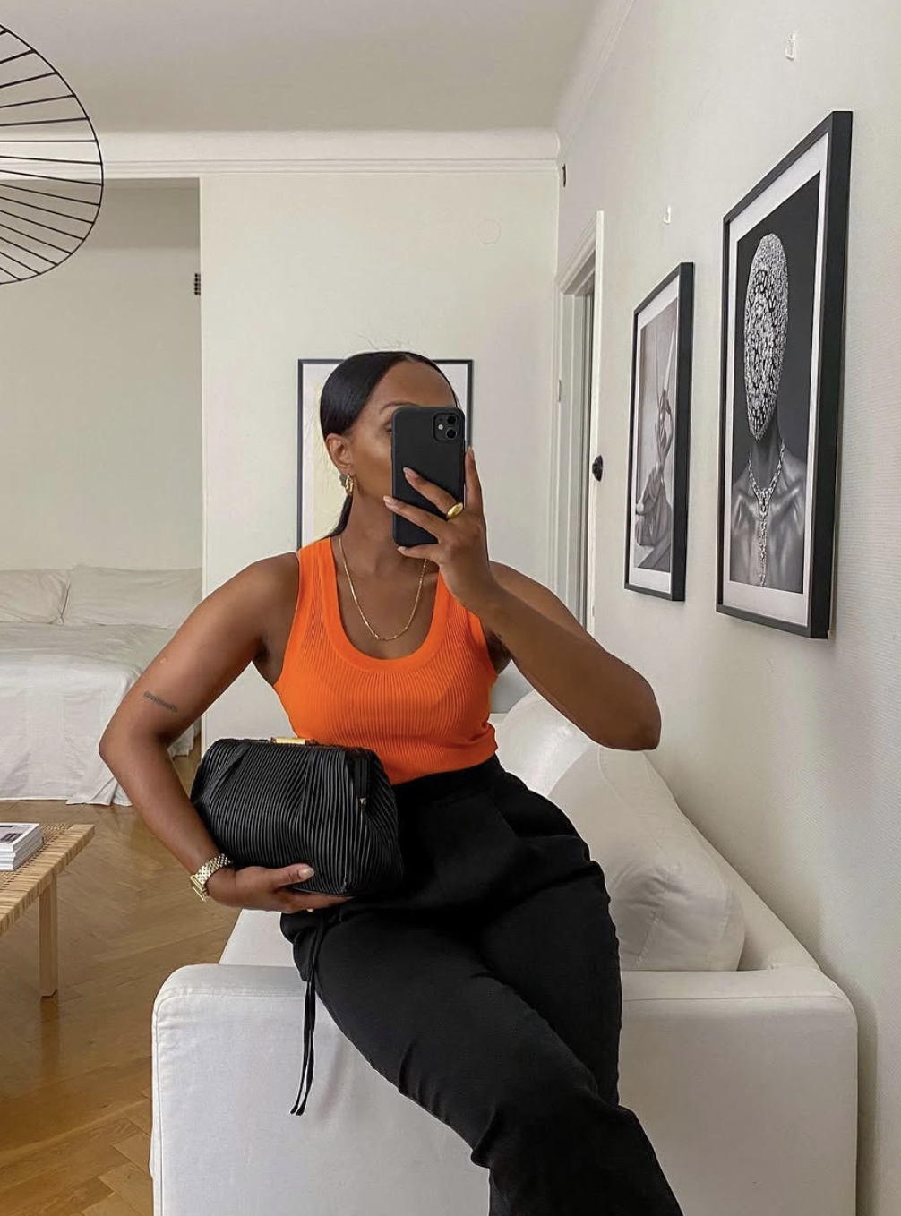
Photo Credit:@femmeblk
Orange is the most misunderstood color in the wardrobe conversation. In its saturated primary form, it is bold and high-energy. But in its muted forms terracotta, rust, burnt orange, amber it becomes one of the most universally flattering colors that exists, particularly on medium to deep complexions where the warmth of the color plays off the warmth in the skin rather than competing with it.
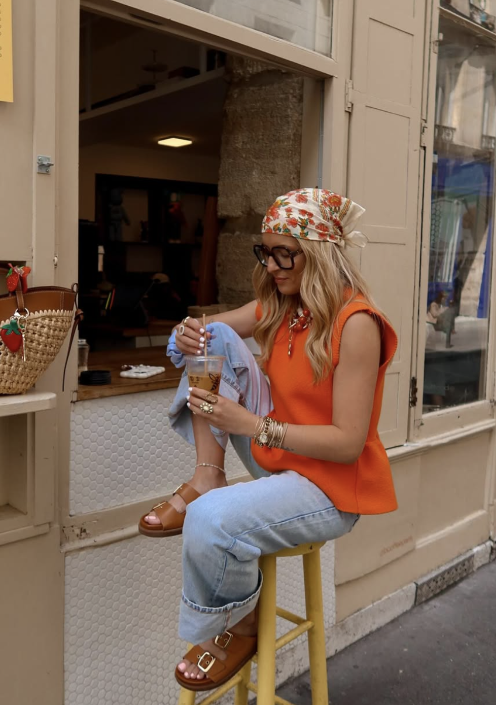
Photo Credit:@ines_rcdd
Terracotta works because it has the richness of a warm neutral with the visual interest of a real color. It pairs naturally with white (fresh and clean), cream (warm and cohesive), and olive green (earthy and intentional). For the bolder version: burnt orange with navy is a high-contrast combination that works because the depth of the navy absorbs the intensity of the orange both colors end up looking stronger for being next to each other.
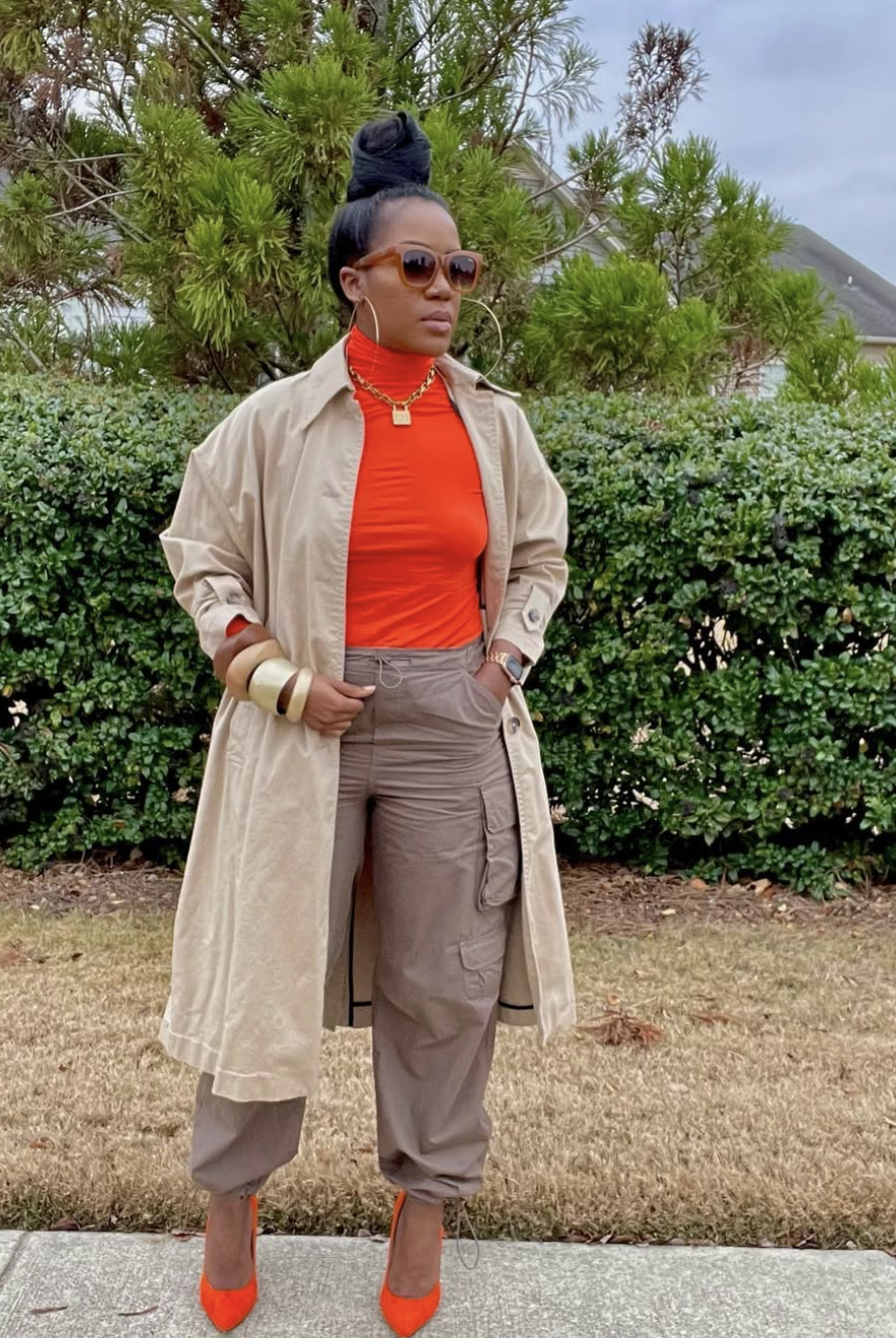
Photo Credit:@theglamcorridor
What separates a good orange outfit from an uncertain one is usually the undertone of the orange itself. Cool-toned oranges (those that lean toward red or brown) are easier to style and more forgiving. Warm bright orange (the kind that reads as close to primary orange) demands more contrast and more deliberate pairing — white or black, nothing in between.
Styling Note: If you're new to orange, start with terracotta accessories. A terracotta bag or sandal against a neutral outfit introduces the color without requiring full commitment. Once you've seen how it reads in your specific wardrobe and against your complexion, scaling up to a terracotta trouser or maxi dress will feel natural instead of risky.
How To Wear Yellow
Photo Credit:@amfashion
Yellow is the color equivalent of a strong opinion: you either commit or you don't. Half-hearted yellow — a washed-out shade worn with uncertain accessories and no clear intention — reads as anxious. Confident yellow reads as someone who has made a decision. The rule is simple: go rich or go subtle. Mustard, gold, and deep ochre are the subtle versions — complex enough that they don't register as primary yellow. Bright lemon and marigold are the bold versions — worn intentionally or not at all.
Yellow's natural partners are white and black. White makes yellow feel fresh and summer-ready, the kind of combination that reads instantly as warm-weather dressing done right. Black makes yellow feel high-contrast and editorial the two colors are pulling hard in opposite directions, and that tension is what makes the outfit interesting. The combination to avoid: yellow with beige or tan, where the warm undertones in both colors muddy against each other rather than complementing.
Photo Credit:@lolagllt_
Styling Note: Mustard is one of the most seasonally versatile colors in a wardrobe. It reads as autumnal in a coat or knit, spring-appropriate in linen, and elevated year-round as an accessory. A mustard bag specifically is one of the best single-color wardrobe investments you can make it adds
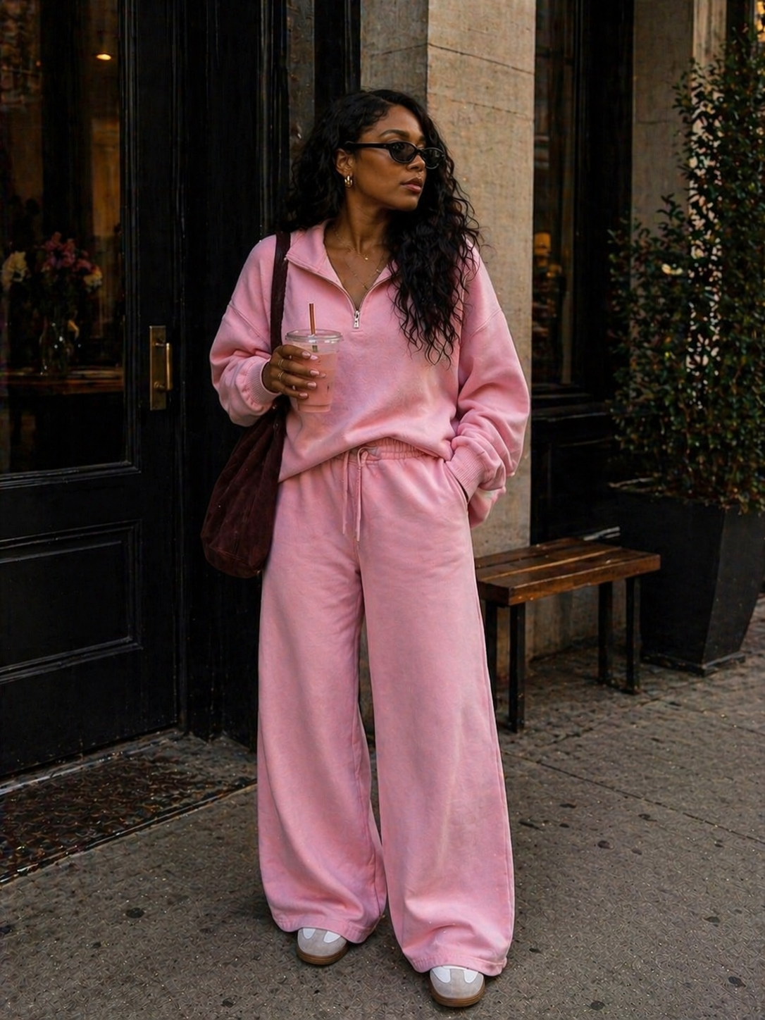
How To Wear Pink
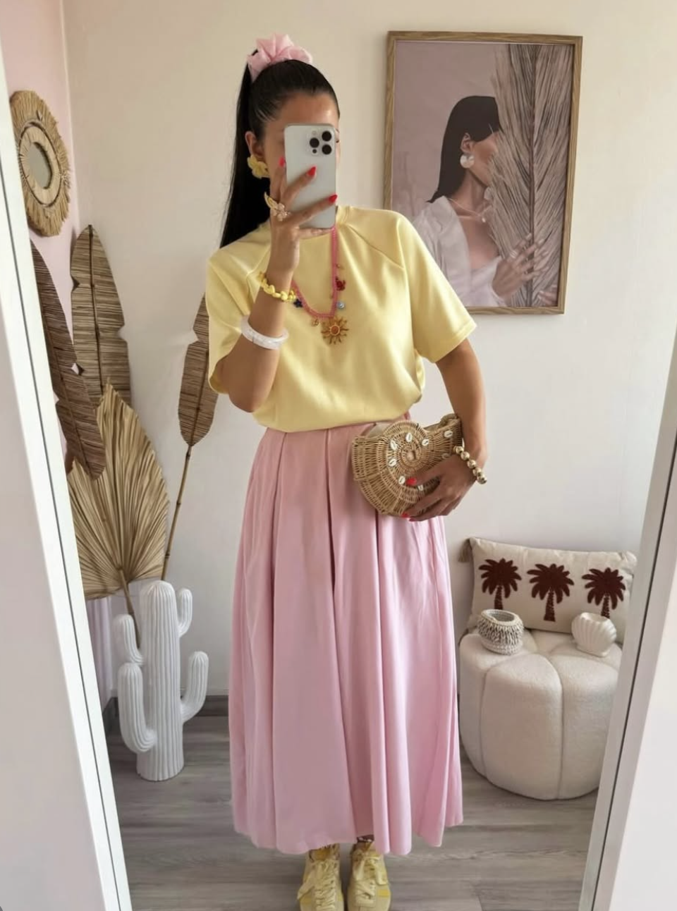
Photo Credit:@outfitbysabrina
Pink's range is wide enough that treating it as a single category doesn't quite work. Blush and dusty rose operate almost as neutrals — low-saturation, warm-toned, and they pair naturally with cream, camel, and white without demanding attention. Hot pink and fuchsia are their own category: bold, high-energy, and specifically flattering on deeper complexions where the color pops against the skin rather than washing into it.
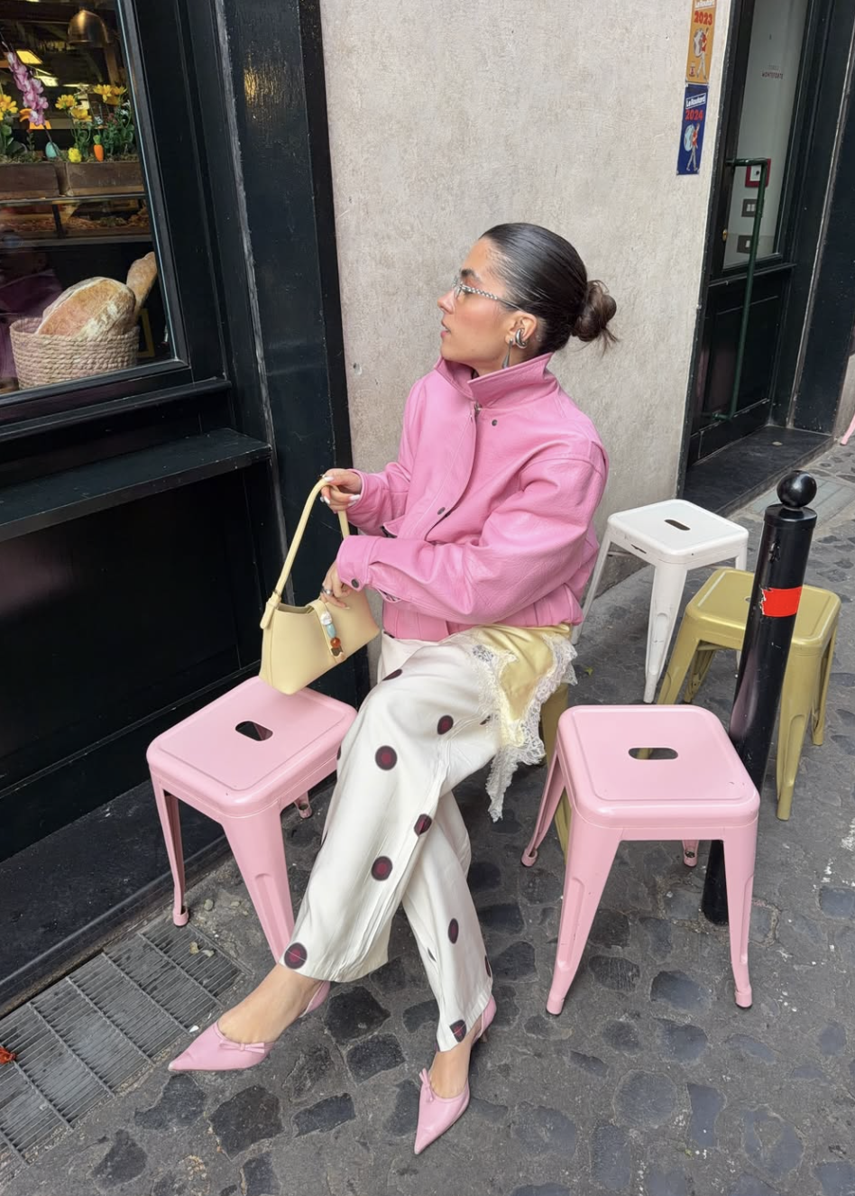
Photo credit:@vorniiic
The combination that makes pink feel modern rather than sweet is pairing it with unexpected neutrals. Pink and grey removes the girlishness and adds edge. Pink and brown — particularly chocolate or espresso is a pairing that sounds wrong and looks right: the warmth of the brown and the brightness of the pink balance in a way that reads as sophisticated rather than juvenile.
And then there's hot pink with red the combination that fashion has been endorsing for several years for good reason. Done right, it is genuinely one of the most striking pairings in this guide. The key is keeping the two shades distinctly different: hot pink needs to be unmistakably pink, red needs to be clearly red. Any visual ambiguity between the two and the combination falls apart.
Styling Note: Pink with camel is an underrated combination that reads as expensive and effortless. A blush midi skirt with a camel longline blazer or a dusty rose knit with camel wide-leg trousers both combinations have the warmth and tonal cohesion that make a look feel finished without visible effort.
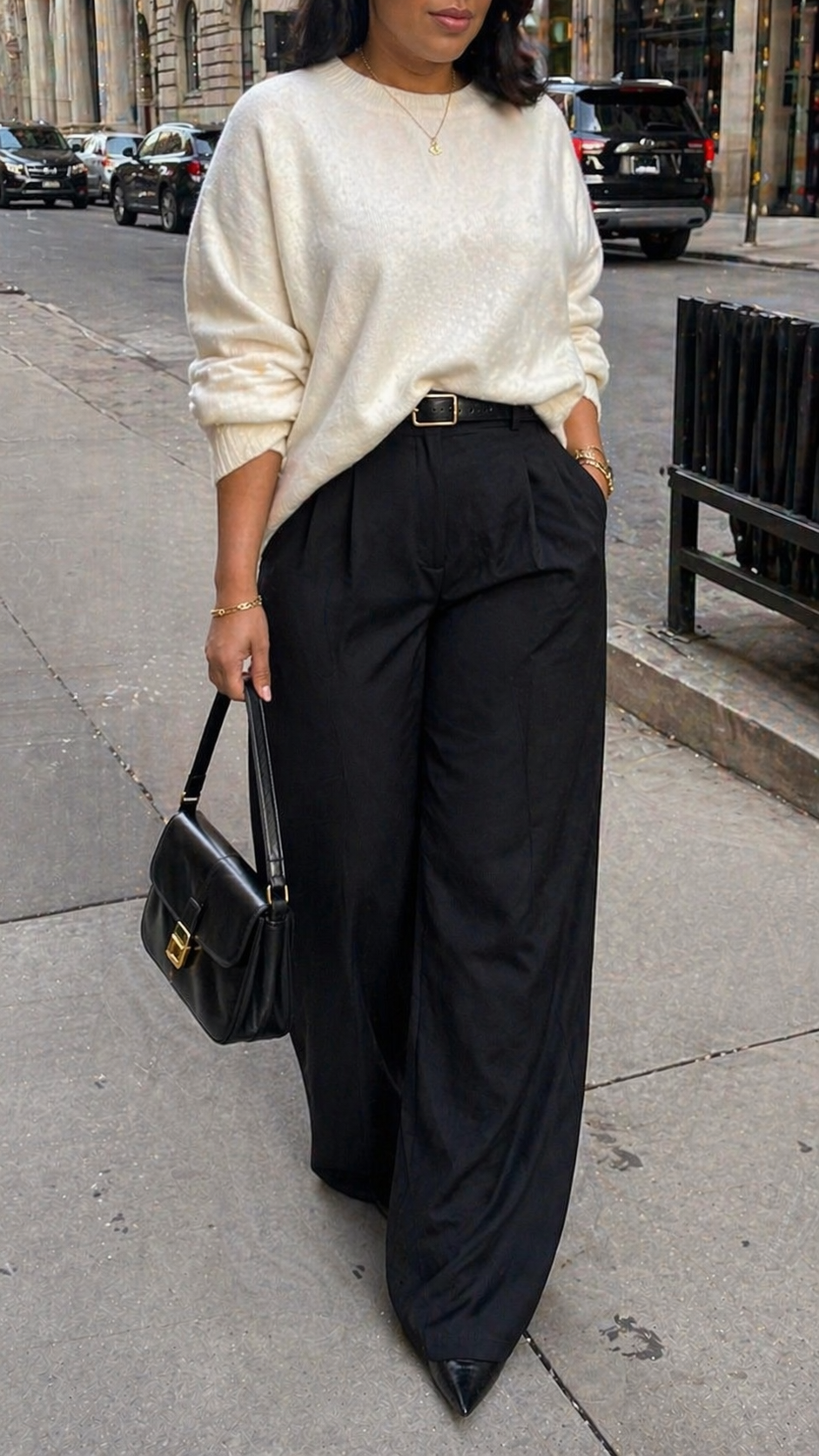
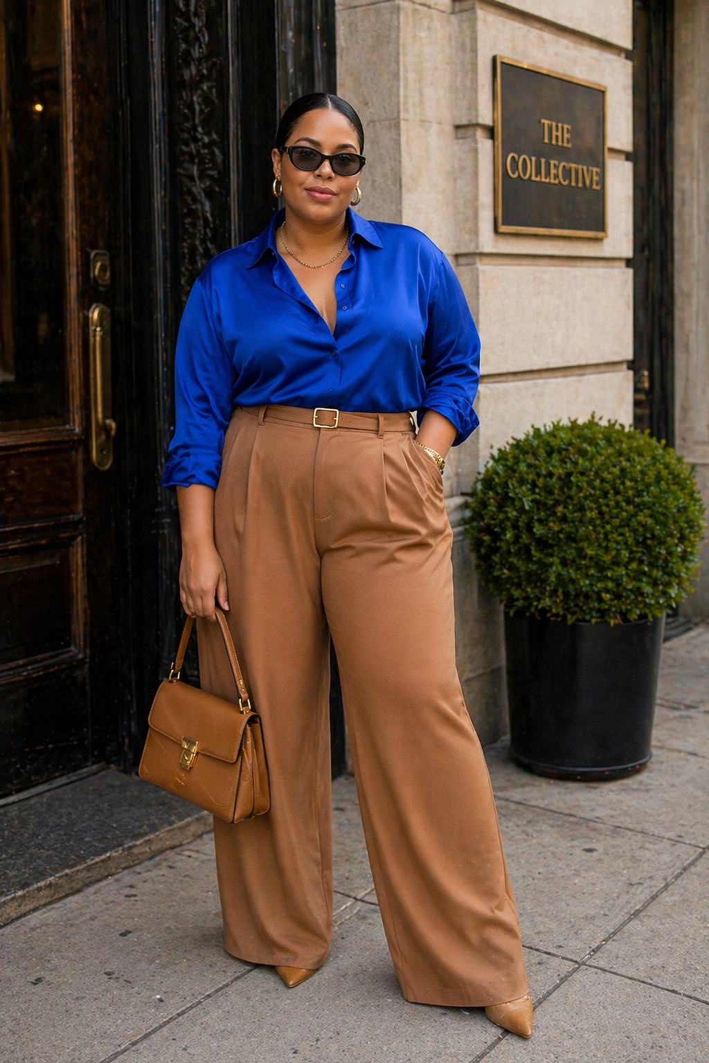
How To Wear Camel
Photo Credit:@meleponym
Camel occupies a unique position in the wardrobe: warm enough to feel like a real color but neutral enough to function as a base. A camel coat makes cobalt look grounded. A camel blazer makes burgundy look expensive. Camel trousers make emerald feel intentional rather than loud. It absorbs the intensity of bold colors and reflects it back as sophistication rather than chaos which makes it the single most useful piece to own when building a color-forward wardrobe.
Photo Credit:@ooliviaorza
The specific quality that makes camel work with virtually every color is its undertone. Because camel carries yellow-orange warmth, it shares tonal ground with most bold colors which means instead of clashing, it complements. It is the peacekeeping neutral. If you own one camel piece and regularly struggle to wear color, start there: put on the camel piece first, then build the color around it.
Photo Credit:@vanessaefiya
Styling Note: Camel and cobalt is the color combination most stylists reach for when they want to look expensive without appearing to try. The warmth of camel and the cool clarity of cobalt create a contrast that is visually exciting but never overwhelming. Keep everything else simple clean lines, minimal accessories and let the combination carry the outfit.
Color on Color The Combinations Worth Knowing
Color blocking wearing two or more distinct colors together without a neutral buffer — is where most people lose confidence. It feels like there should be rules, like certain combinations are allowed and others are forbidden. The reality is that the pairings that look best follow a very consistent internal logic: either the colors are analogous (adjacent on the color wheel, like cobalt and emerald), complementary (opposite on the color wheel, like cobalt and orange), or they share a tonal quality (both warm, both muted, or both jewel-toned).
The combinations worth having memorized: red and pink warm, high-energy, and intentionally unconventional. Navy and burgundy deep, rich, and quietly European. Cobalt and white maximum contrast, minimum confusion. Emerald and camel earthy and sophisticated. Purple and grey restrained and considered. Any of these works as a starting point. Once you've worn two of them, your instinct for what reads as harmony versus what reads as noise develops on its own.
The most common reason color blocking fails is proportion, not the actual combination. When two colors are split 50/50 on the body same-weight top and bottom they compete for dominance and the eye doesn't know where to go. When one color dominates (roughly 60–70% of the look) and the other accents, the outfit has a clear focal point. That single adjustment will fix most color blocking attempts that aren't working.
Styling Note: The easiest way to try color blocking without overthinking it: pick one of the combinations above, buy them in the same silhouette (both loose, both tailored, both relaxed), and wear them as a set. The combination does the work; all you have to do is commit to both pieces at once.
If You're Not Ready — Color Through Accessories
Not everyone is ready to wear cobalt from shoulder to ankle, and that is entirely valid. Color doesn't have to be worn head to toe to be felt. A single color accessory — a bag, a shoe, a belt, a scarf — introduced into an otherwise neutral outfit creates the same effect in miniature: it gives the eye somewhere to land, signals intention, and starts to build your instinct for which colors you actually gravitate toward.
The most effective single color accessory is a bag because it doesn't touch the body. That means it works across complexions, seasons, and silhouettes without any adjusting required. A cobalt bag with a black trouser and white tee. A burgundy bag with a cream dress. A terracotta mule with a navy wide-leg suit. These are complete, considered outfits that happen to also be quiet color introductions.
Styling Note: Color accessories are also the most useful tool for figuring out your color season. If you find yourself consistently reaching for the terracotta bag over the cobalt one even when you tell yourself both are equally attractive that's data. Pay attention to the colors you actually wear, not the ones you love in theory.
More Ways To Wear Color
What Colors Go With Brown Trousers
This Is How to Find the Colors That Actually Flatter Your Skin Tone
17 Monochromatic Outfit Ideas That Will Make You Want to Wear One Color Forever
30 Fail-Proof Neutral Outfit Formulas I’m Copying for a Perfectly Minimalist Closet
What to Wear With Green Pants: 9 Outfit Ideas That Actually Work
What Color Shoes to Wear With a Red Dress (The Rules Fashion Stylist Actually Follow)

Creator Images used for editorial purposes only. All rights belong to their respective creators. We always link and give credit.